A few months ago, I signed up for Kevin Powell’s Responsive Design Bootcamp hosted on Scrimba. Scrimba is an online platform for learning software development via video lessons and live coding along with the teacher. In addition to the phenomenal teachers they have, Scrimba’s interactivity has made it my favorite platform for learning software.

Powell’s course has transformed the way I think about CSS and responsive design. There was a ton about CSS that I was never explicitly aware of before taking the course, and in this post I’ll be sharing some of those learnings. I find that a lot of developers are confused by CSS and find it to be a pain to deal with, but this course reminded me that like with any other human-designed system, there is always some explanation for the behavior you see.
The difference between block and inline
This feels like such a crucial foundation for understanding CSS and yet I was only vaguely aware of the difference. By default, HTML elements have a display: block, which means they take up 100% of the width of their parent element and start with a height of 0, growing to fit the content inside them.
Have you ever created an element and wondered why it doesn’t seem to show up? Or wondered why an element is so wide even though there isn’t much content in it? Or why elements start on a new line even though you intended them to display next to each other?
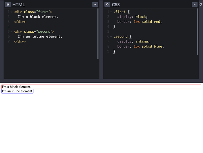
If you were ever confused in such scenarios, it’s likely that the answer was in the distinction between block and inline display modes.
And you’ve probably noticed that some elements (like <span> and the anchor tag <a>) are inline by default, whereas others (like <div> and <p>) are block by default. Block-level elements can contain other block and inline elements, but inline elements can only contain other inlines. Powell has an additional video that does a great deep dive into block and inline and how margins, padding, and height work in each case.
Flexbox
Another display mode aside block and inline is flex. I already knew some of the basics of flexbox going into this course, but there were some intricacies that I learned which helped me understand it better.
In a flex container, if you don’t provide a flex basis, grow, or shrink to the children, they will grow and shrink proportional to the content inside them. The concept of items growing and shrinking to fit their content is a general pattern in CSS that I've come to notice as a result of this course. Previously, I had the intuition that flex children will all have the same width, unless we provide specific values to make them deviate—this is clearly wrong:
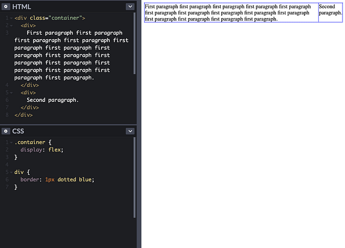
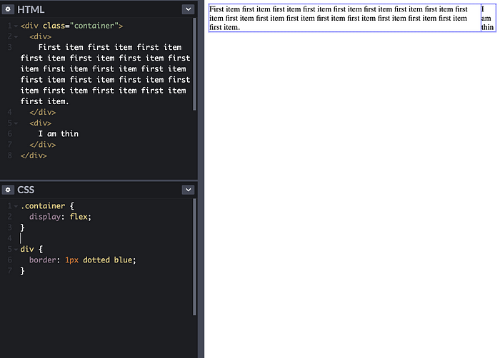
In the example above, the first paragraph grows to be much larger than the second, because it has more text. In particular, the paragraph keeps growing until the second div reaches its minimum width. How is minimum width determined? In this case, it’s just the length of the longest word in the div. Notice this in the layout below — the length of the word “thin” is what ultimately determines the layout:
Margins
Another CSS concept that I only vaguely understood before this course was margins, and their behavior in different contexts. Two specific take-aways stood out:
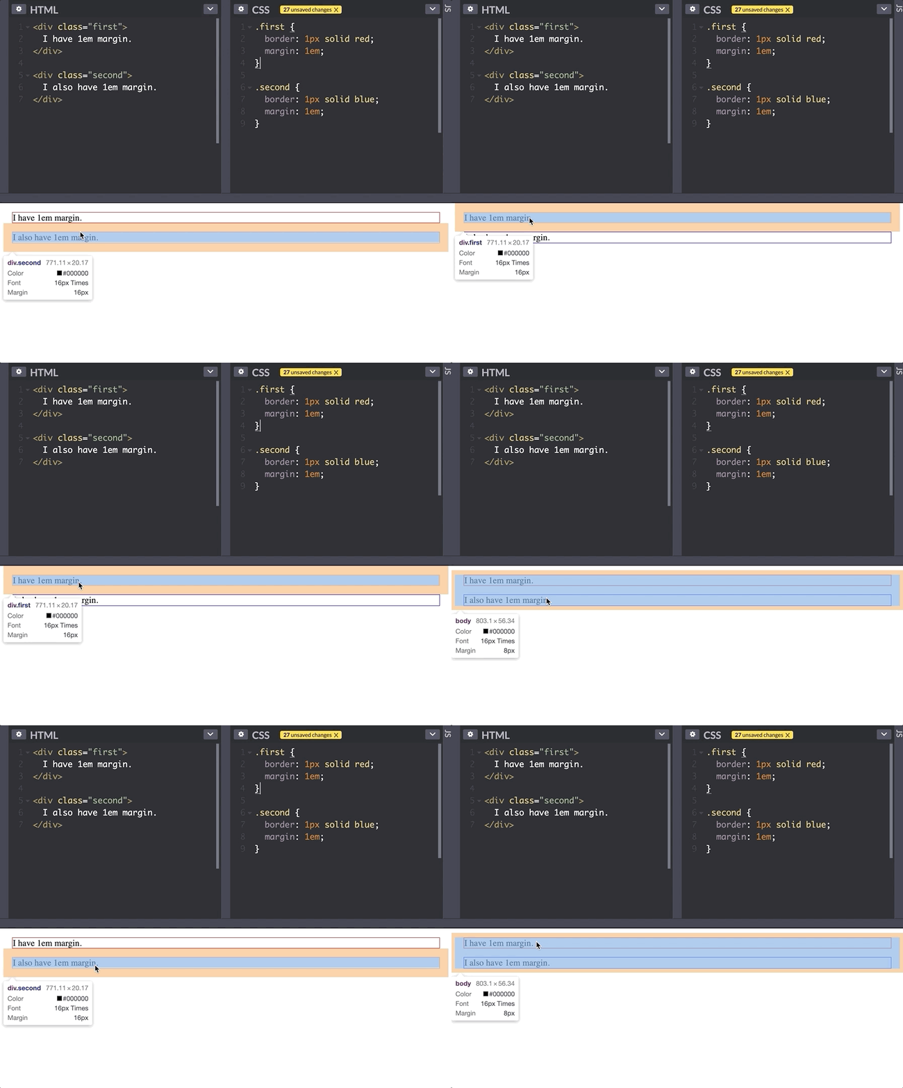
#1. By default, adjacent margins collapse into each other.
Powell points out that this is one of the biggest sources of confusion when working with margins. You can see in the example below that the margins between the first and second element collapse into each other rather than stacking one next to the other.
Further, margins collapse not only between sibling elements, but also between parent and child elements. See below:
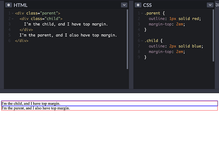
Even though both the parent and the child element have a top margin, only the parent’s top margin appears (seen in the empty space above the red box), because the margins have collapsed. MDN has a great article on the specific conditions in which this collapse occurs. The margins only collapse when they’re touching and there is no content between them such as text, padding, or a border (this is why I used an outline instead of a border in this example).
#2. By default, text elements like <p> have a top and bottom margin of 1em.
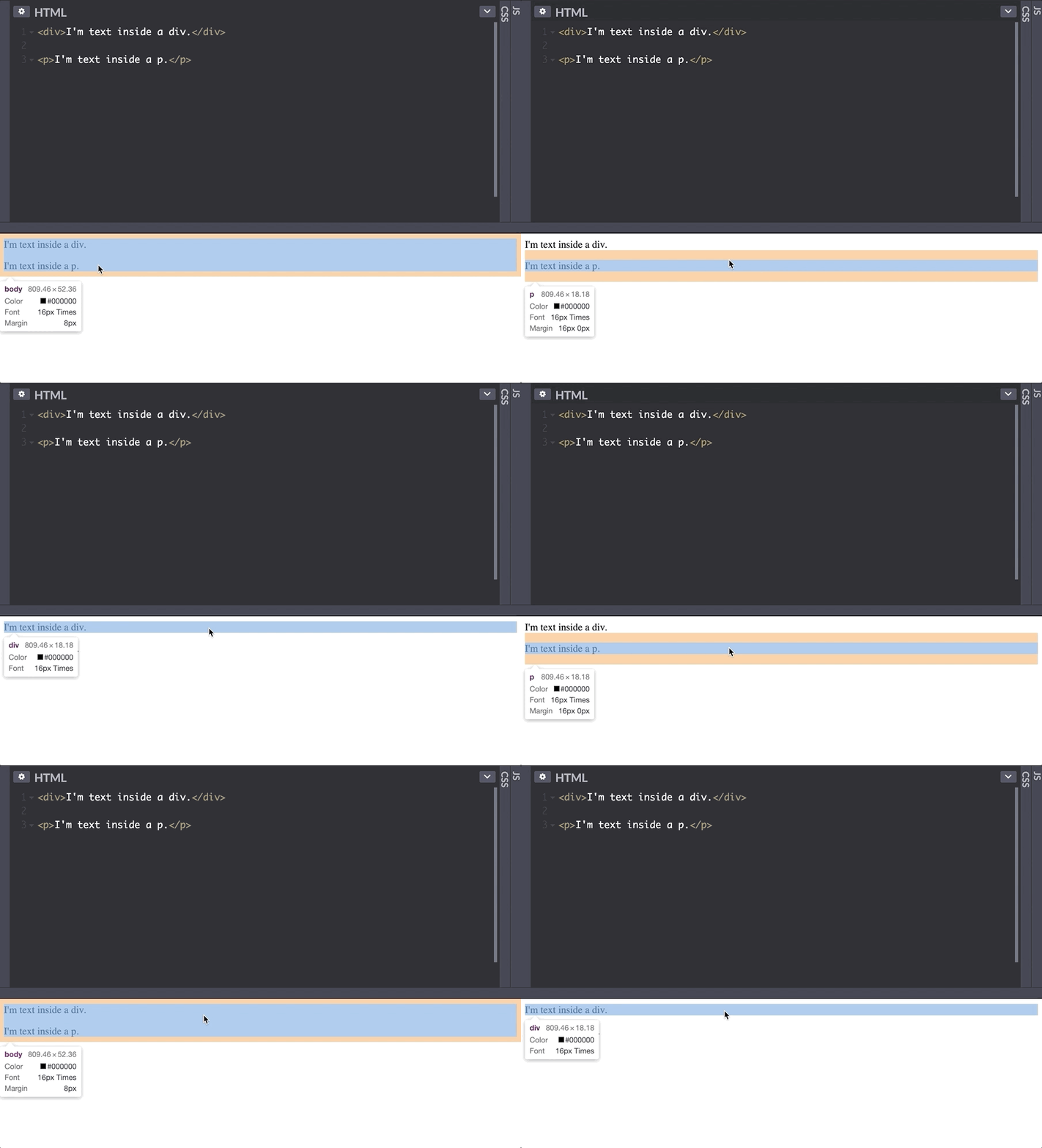
If you’ve ever been confused about why there seems to be random extra space between some of your elements, this default behavior may have been the cause. In contrast to paragraph or heading tags, text inside a <div> does not have this margin. There’s a wide set of default styles like this that can even vary by browser/device, and libraries like Normalize CSS were created to standardize these properties.
Em units
In typography, one em unit is equal to the point size of a font. em units are really helpful for making your padding and margin proportional to the size of the text inside your element.
For a given element, 1em actually means slightly different things depending on the CSS property you’re applying it to:
- When setting
marginandpadding, 1em is equal to thefont-sizeof the element. That means that if I set my padding to 2em and the font size is 16px, the padding will be 32px. - When setting
font-sizeitself, 1em is actually equal to thefont-sizeof the parent element. So if my parent's font size is 16px, and I setfont-size: 2em, that will make my own font size 32px. Then if I set my margin to 2em, the margin will be 32px • 2= 64px.
The consequence of this that em units can cascade on top of each other — if a hierarchy of three nested elements all have a font-size of 2em, the grandchild's font will be 4 times the size of the grandparent.
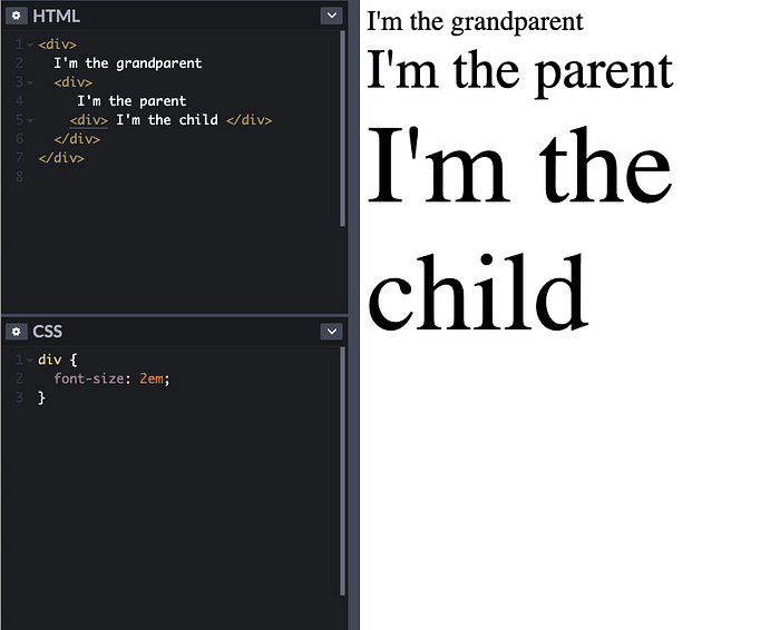
To prevent this, we use the rem unit, which stands for root em. Wherever in the DOM tree you are and whatever CSS property you are setting, 1rem is always equal to the font size of the root element (which, by default, is 16px).
Grid, positioning, background-blend-mode
There were a bunch of other concepts that I either knew nothing about or learned more deeply in Powell’s course. I learned about CSS grid and how it allows you to be both very specific and concise about the layout you want. I understood positioning better, while recognizing it shouldn’t be relied on all the time. I also learned a cool trick in the background-blend-mode property that allows you to add a tint to your background images:
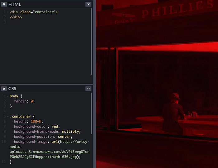
It was surprising to me that we can achieve a nice-looking image effect without having to use any fancy image editors!
CSS is itself a system that evolves over time
Just like the design of a programming language or any other standard, the people who define the CSS spec have to make certain trade-offs and consider various stakeholders in designing the language.
For example, when the flex display mode was introduced, collapsing margins were removed in that specific display mode. You may notice that once you set display: flex, margins no longer collapse. The CSS Working Group made this decision after seeing that collapsing margins were generally confusing for developers. This was an iterative improvement—it's better to drop collapsing margins in newly introduced display mode than changing existing behavior across the web for the block display mode.
Another change that took place in the CSS spec was the definition of the pixel unit. While 1px was originally equal to a single point on the screen, as more and more monitors with varying resolutions were built, the standard was redefined as being 1/196th of an inch.
Some closing thoughts
One of the things I loved about taking this course was that it was a chance to investigate and understand CSS from the ground up; no complex layouts, no fancy libraries—just plain HTML and CSS. Having an understanding of the fundamentals has helped me feel much more confident working in more complex layouts with hundreds of divs and classes on a single web page, because I know it all boils down to a bunch of HTML elements with some properties on them. Powell’s course taught me both specific tips for creating great layouts, as well as a deeper understanding and appreciation for some of the foundational principles of CSS. Any behavior you notice when designing a web page, however confusing it may be, will have an explanation if you investigate closely enough. Working with CSS becomes much more enjoyable once you really understand it.
