We all know that the software products we use are designed to maximize engagement and time spent, often to the detriment of user wellbeing. Movements like the Time Well Spent initiative by Tristan Harris have brought more awareness to this problem in the last few years, with phrases like digital wellbeing and the attention economy becoming part of the common parlance.
There are many tools at our disposal for being more mindful about our digital activity, be it OS-level dashboards like Digital Wellbeing (Android) and Screen Time (iOS), dedicated apps like Forrest, or browser extensions like Intention. Aside from these tools, what I’ve found helpful is to directly edit the content and layout my most frequently visited websites, resulting in less distraction and a more pleasant online experience.
I do this by overlaying web apps with custom CSS. This can be done with a number of browser extensions, like Stylebot and User CSS. In this post I’ll share some of the places I’ve found this to be helpful.
Prelude: Web vs Mobile
One of the major differences between web and mobile is that mobile platforms are more restrictive. There are all kinds of things you can do in a web browser (inspecting elements, modifying the content on the page, using extensions) that are difficult if not impossible to do in a mobile app. For this reason I try to consume content on my computer instead of my phone as much as I can. Not only do I have more fine-grained control on a web client, but it also feels less cramped with the extra screen real estate.
So the tools here only apply to web browsing. I turn off most mobile notifications, so this ends up working for me. Of course, decreasing mobile usage and silencing notifications has its tradeoffs in how quickly you’re able to respond to things, so it’s a personal decision.
Hiding Inboxes
The infinite scrolling feed is the arch-nemesis of focused and intentional internet usage. It’s such a problem that popular Chrome extensions exist specifically for hiding news feeds on an app like Facebook.
But another form of feed that can be detrimental to focus is the inbox on regular chat apps like Messenger.

It might seem counterintuitive at first — after all, the messages that people send you aren’t clickbait optimized to grab your attention. But what I’ve noticed in my usage of Messenger is that I often open the app with one intention (e.g. to ask a friend about something), and then I end up getting distracted and spending 20 minutes responding to the other messages I’ve received. The problem here is that it’s too easy to get sucked into your inbox if you aren’t hyper-focused on the task you want to accomplish.
The solution for me was to hide the inbox by default:

This is done with the following CSS:
div[aria-label="Conversations"] {
    display: none;
}
There are generally two kinds of intention you could have for opening up a messaging app: to see what friends have messaged you, or to send a specific message to someone or check in on a specific thread. The latter usage is what this custom CSS is useful for. So if I want to message my friend Andrew about something, I can do it without being distracted by other messages my friends may have sent in the meantime:
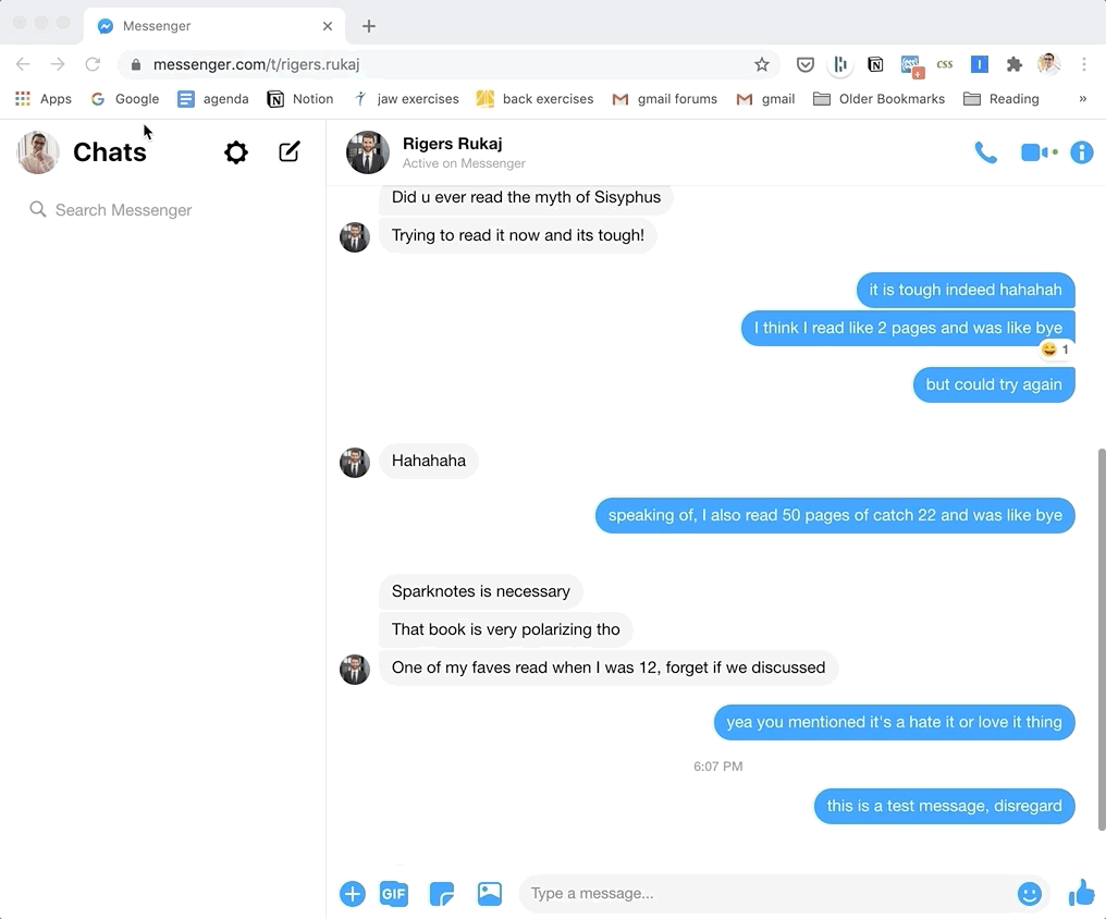
Of course, whenever I do want to see all the messages I’ve received, I can turn off the custom styling with two clicks.
Removing Distracting Elements in Publications
Another big source of distraction is all the widgets that clutter the page in online newspapers: recommended articles, like and share buttons, sticky headers or footers. Some newspapers are better than others with this, but you can use custom CSS to eliminate all the distracting elements:
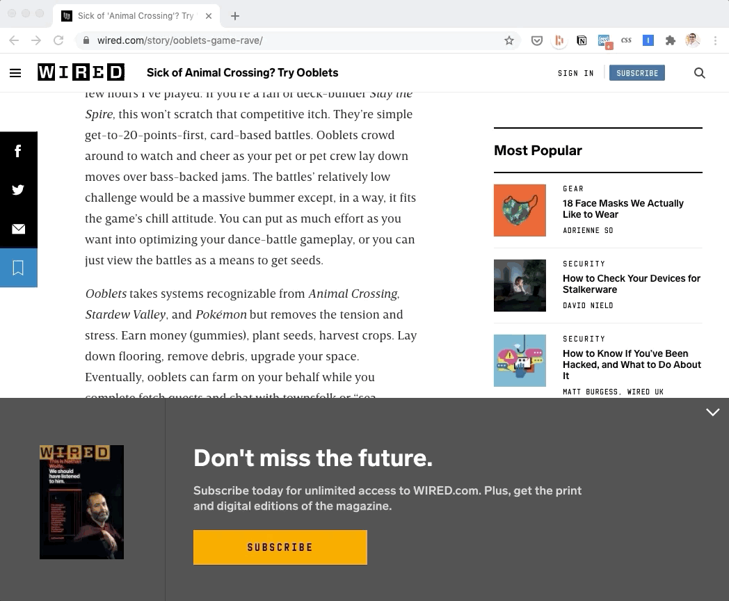
I made the above changes in 5 minutes with the following CSS:
.grid-layout__aside,
.persistent-aside,
.persistent-bottom,
.persistent-top,
.headline-block__headline{
display: none;
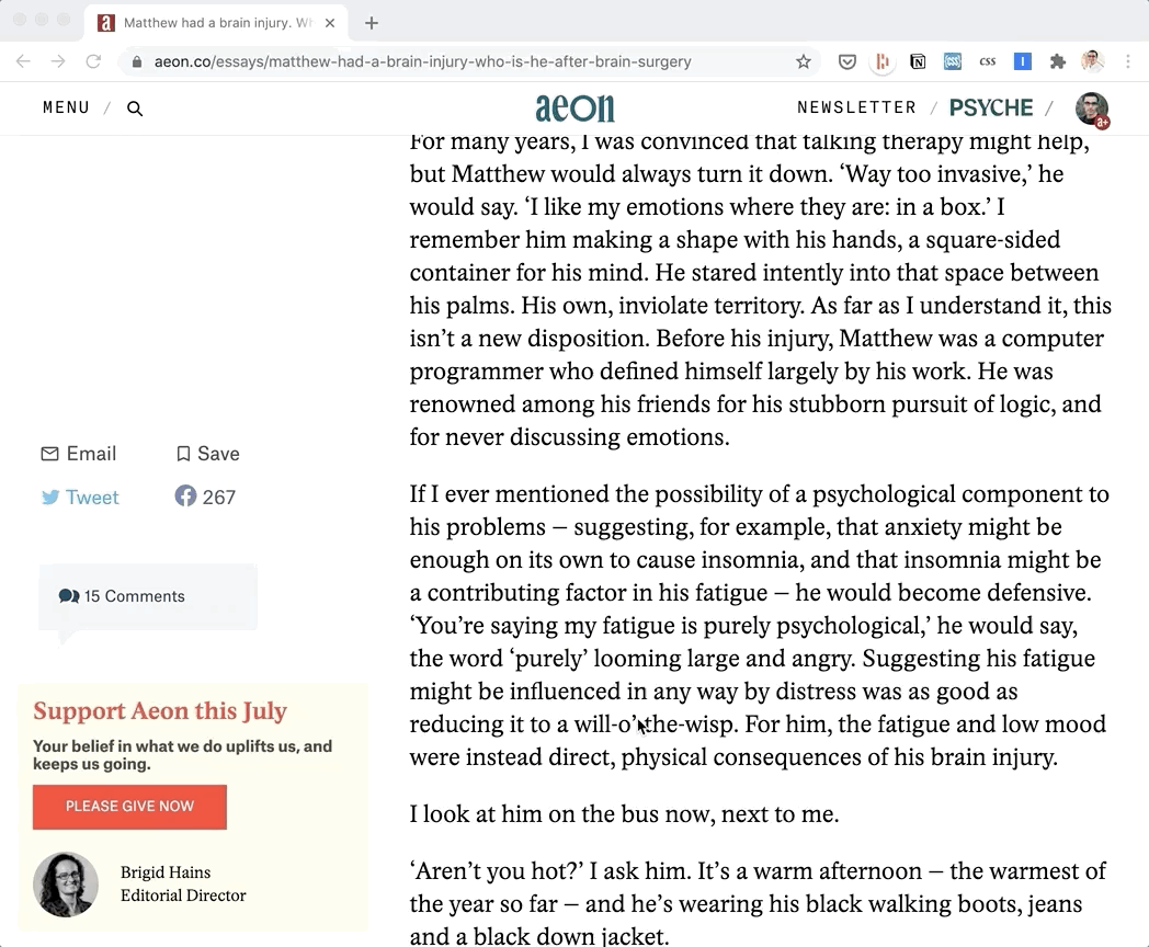
}Wired serves as a good example for how much of a difference reducing clutter can make. Here’s another example with Aeon, which is a lot cleaner by default:
Of course, you can’t do this for every publication, but if there are any that you visit regularly, this is worth the upfront investment.
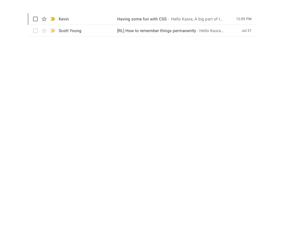
More Focused Email
Gmail is my primary email client, and I follow a good number of email listservs. I want to be able to read through a newsletter without all the other distracting buttons and elements on the page. This can be done with the following CSS¹:
.AO {
    position: absolute;
    top: 0px;
    left: 0px;
    width: 80vw;
    height: 90vh;
    padding: 5vh 10vw;
}.aiw, .aeN, .aeH, .aKh, .aeG {
    display: none;
}div[aria-label="Side panel"] {
    display: none;
}
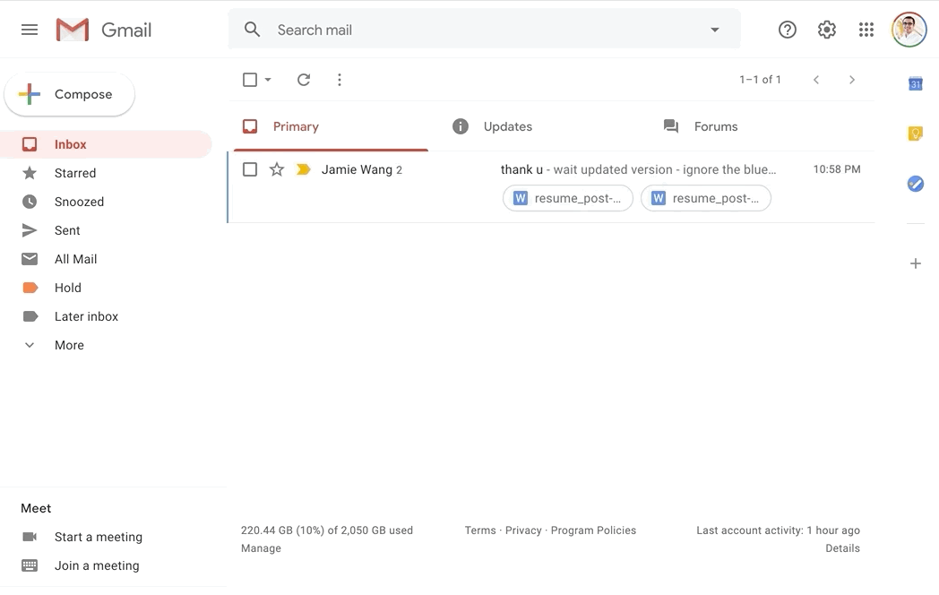
Now, browsing through emails is much more pleasant. You can still reply, navigate, and take other actions with keyboard shortcuts.²
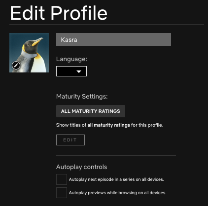
Bonus: Take Advantage of Settings!
This has nothing to do with CSS, but lots of apps have settings you can use to nudge yourself into more mindful usage. As an example, you can actually turn off autoplay on Netflix by going to profile settings → autoplay controls. If you find that a particular app is really distracting for you, see if they have settings that can help.
Conclusions
The key with all of these changes is not to disengage from social media or the internet altogether, but to set clear intentions, and then to establish systems that make it as easy as possible to follow those intentions.
You don’t want to rely on willpower alone. With any product, ask what your intended usage of it is. How often and for how long do you want to use it? What do you want your experience to feel like — relaxing? inspiring? challenging? What can you do to make those experiences more likely to occur with each sign on? With many sites, it’s surprising how much power there is in modifying the layout of the page to nudge yourself towards your own intended behavior.
Footnotes
- A friend noted that a browser extension exists that does this and more!
- To see all keyboard shortcuts in Gmail, just type: ⇧ + ? (shift and question mark).